scope of services…
- Branding
- Stationery
- Leasing Collateral
- Printing
- Site Plan Redraw/Color
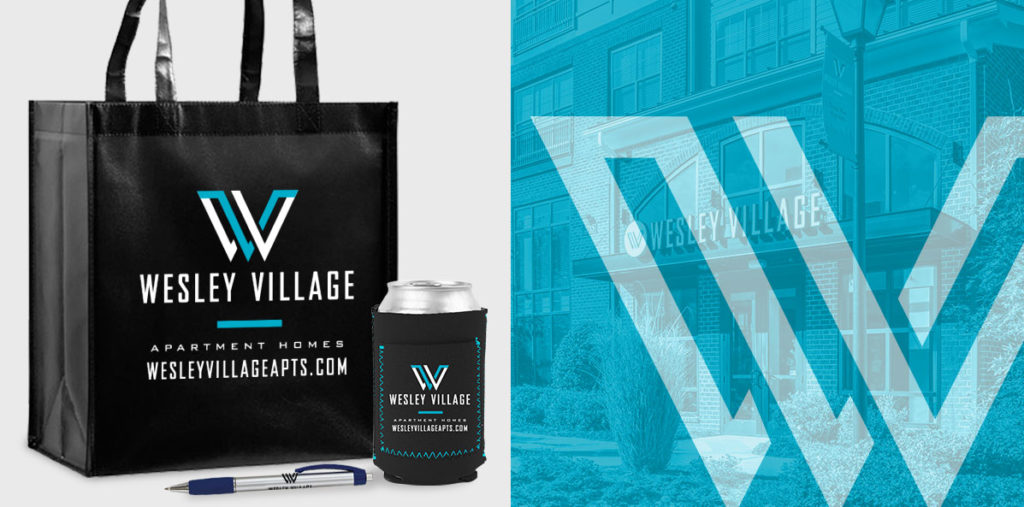
- Promotional Products
brand challenges
Wesley Village was an older building that began renovating during the “Freemore West Movement,” which elevated the neighborhood into popularity. The brand needed a refresh to capture attention in a competitive market and attract a wider audience with more modern design.
GOALS
- Appeal to their millennial base while also attracting new residents in their 40s.
- Stand out from the strong competition nearby and in neighboring areas.
- Be true to the history and character of the area, but without feeling out of date.
- Communicate the value of the price, amenities, and location.

brand solutions
This award-winning brand was tackled with a logo and mood board first to set a tone for the rest of the pieces, combining clean, modern looks with a touch of grit.
APPROACH
- We avoided the greens competitors were using and opted for a fresh, bright blue and dramatic black and white color scheme.
- The texture adds a nod of historic character while hard edges and flat shapes maintain a very modern feel.
- Messaging focuses on value, location, lifestyle, and the unique amenities that make the brand stand out.
- Attention-grabbing angles continue through the brand in an unusual brochure style.


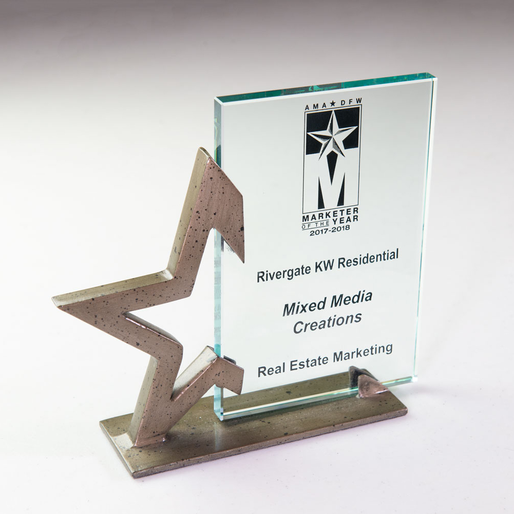
American Marketing Association
Marketer of the Year Awards
Real Estate Marketing Category


